🛠️ Optional PDP Sections
Hero Image
Settings (Global)
Enable Parallax
Changes the hero image to be a parallax image
Enable Opacity
Toggles the opacity layer over the hero image when enabled
Opacity Color
A color picker that allows a specific color of the opacity layer
Opacity Strength
A slider that controls the transparency strength of the opacity layer; 0 is fully transparent and 1 is a solid color.
Desktop Image
The image that will be featured on desktop only. The only time this will be shown on mobile is if a mobile image has not been specified. Recommend 16:9 aspect ratio for desktop.
Mobile Image
The image that will be featured on mobile only. Recommended 2:3 aspect ratio for mobile.
When adding an image to the mobile slot, make sure you crop wider banners to be more square. This will make the images work better with content on top of it.Content Alignment
Determines the position that the overlay content should have over the background image. Has the following options:
Top Left
Top Middle
Top Right
Middle Left
Middle
Middle Right
Bottom Left
Bottom Middle
Bottom Right
Text Alignment
Determines the text alignment of the overlay content. Has the following options:
Left
Center
Right
Primary Heading
The heading of the overlay content. Leave blank if no heading is required for the section.
Primary Heading Font Weight
Determines the font style of the heading. Has the following options:
Light
Normal
Bold
Secondary Heading
The subheading of the overlay content. Leave blank if no heading is required for the section.
Secondary Heading Font Weight
Determines the font style of the subheading. Has the following options:
Light
Normal
Bold
Content Description
The content description that is displayed underneath the heading and/or the subheading. Leave blank if no description is required.
Button Type
Determines the type of button that shows underneath the description. Has the following options:
None
Links To Page
Opens Video Modal
Button Text
The text of the button. If missing, the Links to page button will not show
Button Link
The link of the button. If missing, the Links to page button will not show
Play button
The Button image for the play button. If missing the button will not show.
Video URL
The video url is used to add a video to the modal popup. To grab a link for a video, navigate to the Shopify file system and copy the link associated with the video you'd like to add. Leaving this blank will cause no video to load into the video modal when the user clicks on the Play button.
Text Block
Settings (Global)
Max Width of Text Block
A number that specifies the maximum width of the text block. If left blank, it has a default max width of 500px.
Background Color
The background color of the entire Text block section
Content Padding
Determines how much padding should be applied to the Text Block. Has the following options:
No Padding - 0.25em
Small Padding - 0.75em
Medium Padding - 1em
Large Padding - 2em
Content Alignment
Determines the content alignment of the text block. Has the following options:
Left
Center
Right
Text Alignment
Determines the text alignment of the text block. Has the following options:
Left
Center
Right
Heading
The heading of the text block. Leave blank if no heading is required for the section.
Heading Color
The color for the heading in the text block.
Subheading
The subheading of the text block. Leave blank if no subheading is required for the section.
Subheading Color
The color for the subheading in the text block.
Paragraph
The paragraph description of the text block. Leave blank if no paragraph description is required for the section
Paragraph Color
The color for the paragraph description in the text block.
Display Highlights
Settings (Global)
Featured Image
The image featured by itself without any content. This image does NOT show on mobile.
Content Image
The image featured above the content heading and paragraph. This image shows on both mobile and desktop.
Heading
The heading text for the display highlights
Paragraph
The paragraph text for the display highlights
Reverse Order of Layout
When enabled, the order of content on desktop is reversed.
Absolute Images
Settings (Global)
Base Layer Image
Image will span the entire width of the section and act as a neutral starting point for the images on top of it. If left blank this section will not function properly
Background Color
Determines the background color of the section. Will only really be noticeable on base layer images with transparency.
Settings (Block)
Image
The image that will be displayed on top of the background image
Top Position
How far from the top you'd like the image to be across all screen sizes (slider)
Left Position
How far from the left you'd like the image to be across all screen sizes (slider)
Image Layer
A number that specifies the layer priority. If the layer needs to be on top of another layer, a higher layer number is required. If the layer needs to be below another layer, a lower layer number is required. If no number is entered, the default layer will be 1. Do not use negative numbers.
Image Width
Specifies the how wide an image should be across all screen sizes. (slider)
Modes Slider
Settings (Global)
This section has no global settings. Default behavior for section is a 2 x 1 layout on desktop and a 1 x 1 layout on mobile. Slide dots are always visible.
Settings (Block)
Slide Image
The image that should be displayed on the current slide. if left blank, no image will appear on the slide
Slide Heading
The heading text that should be displayed on the current slide. If left blank, no text will appear on the slide.
Accordion
Settings (Global)
Section Background Color
the background color for the entire accordion's section. Leave transparent if you want the theme's default background color.
Settings ( Specifications Block )
Tip: If you don't need this block within the accordion, don't add the block to the settings.
Expand by Default
Toggles if the accordion should start expanded or closed on page load
Desktop Chart Image
The image that displays on the right of the chart on desktop. Displays above the chart on mobile.
Screen Size
The screen size data for the current product.
Dimension
The dimension data for the current product
Weight
The weight data for the current product
Energy Consumption
The energy consumption data for the current product
Brightness
The brightness data of the current product
Refresh Rate
The refresh rate data of the current product
Resolution
The resolution data for the current product
Aspect Ratio
The aspect ratio data for the current product
USB Slot
The usb slots for the current product.
Settings ( Compatibility Block )
Tip: If you don't need this block within the accordion, don't add the block to the settings.
Expand by Default
Toggles if the accordion should start expanded or closed on page load
Supported Devices Description
The description that displays underneath the accordion title when expanded.
Enable Windows Icon
Determines if the Windows Icon should appear in the accordion.
Enable Apple Icon
Determines if the Apple Icon should appear in the accordion.
Enable Switch Icon
Determines if the Switch Icon should appear in the accordion.
Enable DeX Icon
Determines if the DeX Icon should appear in the accordion.
Settings ( In the Box Block )
Tip: If you don't need this block within the accordion, don't add the block to the settings.
Expand by Default
Toggles if the accordion should start expanded or closed on page load
Desktop Chart Image
The image that displays on the right of the chart on desktop. Displays above the chart on mobile.
Box Contents
Determines the contents of the "in the box" chart. Ese the following notation to define a row:
DUEX MAX::x1. Denote a new line with a "||" The "::" separates the left and right column data.
Sample Data
DUEX Max::x1||Laptop Magnets::x4||USB Cable::x1||User Manual::x1
Settings ( FAQs Block )
Tip: If you don't need this block within the accordion, don't add the block to the settings.
Expand by Default
Toggles if the accordion should start expanded or closed on page load
Questions per Row
Determines the amount of columns we have in our FAQ grid. Always defaults to One on mobile.
One
Two
Three
Question 1-10
Text fields for each question related to a product. Leave blank if you don't need that question field.
Answer 1 - 10
Text fields that associate an answer with each question. Leave blank if you don't need that answer field.
Compatibility
Additional configuration may be required by a developer to get this section working. We will need the video that we want to turn into the flip book. We will extract the frames from the video. Frames of the video will then need to be renamed based on where the last frame was in the flipbook. If the last frame was 231. The next starting frame should be 232 -> X.
Settings (Global)
Top Heading
The lighter heading that is displayed at the top of the section. Leave blank if no top heading is desired.
Bolder Heading
The secondary heading that is displayed under the top heading. Leave blank if no bold heading is desired.
Compatibility text
The description text that is positioned under the headings. Leave blank if no text is desired.
Starting Frame Number
The name of the first image in your flip book. Format of image should be x.png
NOTE: If left blank, default is 1
Ending Frame Number
The name of the last image in your flip book. Format of image should be x.png
NOTE: If left blank, default is 231
MacOS Frame Number
The name of the first frame that features MacOS in your flip book. Format of image should be x.png
NOTE: If left blank, default is 45
Windows Frame Number
The name of the first frame that features Windows in your flip book. Format of image should be x.png
NOTE: If left blank, default is 102
Nintendo Switch Frame Number
The name of the first frame that features Nintendo Switch in your flip book. Format of image should be x.png
NOTE: If left blank, default is 157
Android Frame Number
The name of the first frame that features Nintendo Switch in your flip book. Format of image should be x.png
NOTE: If left blank, default is 202
Comparison Tool
Settings (Global)
Layout Options
Determines the amount of columns we have in our Comparison grid. Always defaults to Two on mobile.
Two Columns
Three Columns
Four Columns
Select a Logo for Microsoft
Image picker to select a logo for Microsoft that will show in the Compatible with section.
Select a Logo for macOS
Image picker to select a logo for macOS that will show in the Compatible with section.
Select a Logo for Android
Image picker to select a logo for Android that will show in the Compatible with section.
Select a Logo for Nintendo Switch
Image picker to select a logo for Nintendo Switch that will show in the Compatible with section.
Settings (Block)
Product Image
The image that should be displayed for the product.
Product Name
The name of the product.
Display Type
The type of display the product has.
Screen Size
The screen size of the product. Do not include the " character in the field. Will result in page errors.
Product Dimension
The product dimension data. Do not include the " characters in the field. Will result in page errors.
Weight
The product weight data.
Is Compatible with Microsoft?
Determines if the product should show the Microsoft compatibility image
Is Compatible with macOS?
Determines if the product should show the macOS compatibility image
Is Compatible with Android Phones?
Determines if the product should show the DeX compatibility image
Is Compatible with Android Tablets?
Determines if the product should show the DeX compatibility image
Is Compatible with Nintendo Switch?
Determines if the product should show the Nintendo Switch compatibility image
USB Slots
The amount of usb slots the product has.
Color Options
A list of colors that should be displayed on the product. These should be separated by a "|". Below is the complete list of available colors that can be used.
Blue
White
Black
Sky Blue
Purple
Green
Deep Grey
Metallic Black
Gunmetal Grey
Grey
Lilac Misty
Jadeite Green
Set Sail Blue
Really Dark Grey
Navy
Red
Grey Green
Auto Rotation
The text data that represents if the product can auto rotate.
Material
The text data that represents the material the product is made from
Product Overview
Settings ( Global )
Section Title
The custom title of the section
Description
The custom text under the title
Settings ( Specs Modal Block )
This section is not required. If you leave it out, the specs modal button will not render under the overview text.
Button Text
The custom text for the button.
Screen Size text
The custom text for the screen size within the modal. If left out, this grid item will not display in the modal.
Dimension Text
The custom text for the dimension size within the modal. If left out, this grid item will not display in the modal.
Color Text
The custom text for the color text within the modal. If left out, this grid item will not display in the modal.
Brightness Text
The custom text for the brightness text within the modal. If left out, this grid item will not display in the modal.
Refresh Rate Text
The custom text for the refresh rate text within the modal. If left out, this grid item will not display in the modal.
Resolution Text
The custom text for the resolution text within the modal. If left out, this grid item will not display in the modal.
Aspect Ratio Text
The custom text for the aspect ratio text within the modal. If left out, this grid item will not display in the modal.
Material Text
The custom text for the material text within the modal. If left out, this grid item will not display in the modal.
Compatible with Microsoft?
Enables the Microsoft text under the compatibility grid. If Mac and Microsoft are not active, this grid item will not display.
Compatible with Mac?
Enables the Mac text under the compatibility grid. If Mac and Microsoft are not active, this grid item will not display.
Compatible with DeX?
Enables the DeX text under the compatibility grid. If DeX and Nintendo Switch are not active, this grid item will not display.
Compatible with Nintendo Switch?
Enables the Nintendo Switch text under the compatibility grid. If DeX and Nintendo Switch are not active, this grid item will not display.
USB Slots
The custom text for the USB Slots text within the modal. If left out, this grid item will not display in the modal.
Settings ( Feature List Block )
Bullet Point types
Determines the type of bullet point that displays next to the feature titles
Checkmarks
Dots
None
Feature Titles
A text area where you can enter each list item that will display next to the bullet point. Separate each item by ||. This field must have the same amount of items as the feature descriptions or it will not display.
Feature Descriptions
A text area where you can enter each description that will display under each bullet type. Separate each item by ||. This field must have the same amount of items as the feature titles or it will not display.
Settings ( Highlights Block )
Every Image and Text field is not exclusive to a particular icon / text set. You can put whatever image / text you want into the fields. Think of the field names as more of a rough guideline.
Screen Size Image
The custom image for screen size
Screen Size Text
The custom screen size text
Resolution Image
The custom image for Resolution
Resolution Text
The custom resolution text
Weight Image
The custom image for Weight
Weight Text
The custom weight text
Thickness Image
The custom image for Thickness
Thickness Text
The custom thickness text
Eyecare Image
The custom image for Eyecare
Eyecare Text
The custom eyecare text
Screen-to-Body-Ratio Image
The custom image for screen-to-body-ratio
Screen-to-Body-Ratio Text
The custom screen-to-body-ratio text
Advanced Featured Video
Settings ( Global )
Subtitle
The custom text for the subtitle
Title
The custom text for the title. You can use a <br> in the text field so that you can force the title to a new line when needed.
Featured Video URL
The url for the video that will be featured under the content. You must upload your video to the shopify cdn before the link can be used in this section.
Button Type
Allows custom selection of how the button should behave. It has the following options:
Opens Video Modal - Button links to a modal that can play a shopify video
Redirects - Button links to an external source.
Button URL
When the Button is set to "Opens Video Modal"
- Button accepts 2 types of URLs
- a URL that is from the shopify CDN
- a URL that is an external video link for an iframe ( youtube , vimeo )
When the Button is set to "Redirects"
- Button any URL
Background Color
The background color of the section
Title Color
The color of the text for the title
Subtitle Color
The color of the text for the subtitle
Button Color
The color of the button
Brand Ambassadors Section
Settings ( Global )
Featured Quote
The custom quote text
Featured Brand Ambassador Image
The custom image for the brand ambassador
Brand Ambassador's name
The name of the brand ambassador
Brand Ambassador's Job Title
The custom text for the title of the brand ambassador
Featured Ambassador Video
Raw HTML from Youtube's embed feature. To get the code, see YouTube's help guide.
Background Color
The custom background color for the section. Default is #000.
Ambassador's Quote Color
The custom color for the ambassador's quote. Default is #FFF.
Ambassador's Name Color
The custom color for the ambassador's name. Default is #FFF.
Ambassador's Job Title Color
The custom color for the ambassador's quote. Default is #7c7c7c.
Blocks ( Video )
Video Embed
Raw HTML from Youtube's embed feature. To get the code, see YouTube's help guide.
Simple Slideshow Section
Settings ( Global )
Layout Options ( Desktop )
A dropdown that allows you to select the type of layout the section should have on desktop. Mobile folds down into the same general look regardless of selection.
Slides On Top - Slides will be full width and be on top of the content
Slides On Left - Slides will display on the left side of the content
Title
The custom text for the title.
Subtitle
The custom text for the subtitle. Can be left blank.
Description
The custom text for the description. Can be left blank.
Section Background Color
The custom background color for the entire section.
Title Color
The custom color for the title text
Subtitle Color
The custom color for the subtitle text
Description Color
The custom color for the description text
Microsoft Logo
The custom image for the Microsoft logo. Can be left blank if no logo is desired.
This setting only works when the "Slides On Left" option is selected.
macOS Logo
The custom image for the macOS logo. Can be left blank if no logo is desired.
This setting only works when the "Slides On Left" option is selected.
Android Logo
The custom image for the Android logo. Can be left blank if no logo is desired.
This setting only works when the "Slides On Left" option is selected.
Nintendo Switch Logo
The custom image for the Nintendo Switch logo. Can be left blank if no logo is desired.
This setting only works when the "Slides On Left" option is selected.
Blocks ( Slide Image )
**NOTE** Having Only 1 Block is totally fine! The slide dots and slide arrows will not be displayed!Slide Image
The custom image for the slide
Enable Overlay Content
Toggles if any content should be displayed on top of this slide
Content Position
Allows specification on where the content should be displayed on the slide. Has the following Options:
Left
Middle
Right
Enable Divider Bar
Toggles a solid border on the left side of any given content
Overlay Content Color
When specified, this color controls the color of the border as well as any text within the content
Overlay Content
This setting is very easy to mess up so we have provided a template below to help with this. Some core things to understand about this setting:
- It accepts any raw HTML
- Any elements outside of <h1> -> <h6> and the <br> elements are not supported.
Overlay Content Template" lineNumbers="true"
<h2>HEADING GOES HERE</h2>
<h5>DESCRIPTION GOES HERE</h5>
<br>
<h2>HEADING GOES HERE</h2>
<h5>DESCRIPTION GOES HERE</h5>
ONLY modify the text between each HTML tag. If for some reason the text doesn't look correct, please delete the content in your text field and copy this template back over.
Blocks ( Slide Video )
Video URL
The url for the video that will be featured on the slide. You must upload your video to the shopify cdn before the link can be used in this section.
Before and After Section
Settings ( Global )
Subtitle
The custom text that displays above the main title
Title
The custom text for the section title
Description
The custom text for the section description
Before Image
The image used to represent the before state ( left side of the slider )
After Image
The image used to represent the after state ( right side of the slider )
Reverse Layout (Desktop)
Reverses the layout on desktop.
Enable Before Text
Enables text that will display when the slider bar is more than 20% from the start of the image.
Before Text
The text that will display within the left box
Enable After Text
Enables text that will display when the slider bar is less than 20% from the end of the image.
After Text
The text that will display within the right box
Simple Accordion Section
Settings ( Global )
Section Background Color
The custom color for the background of the section
Accordion Heading
The custom title for the section
Accordion Image ( Desktop )
The custom image for the accordions section. This image will always display to the left of the accordions content.
Settings ( Content Block )
Expand by default
Expands the accordion content by default on page load.
Heading
The custom heading text for the current accordion
Body Content
The custom body text for the current accordion
Product Overview (Dark)
Settings ( Global )
Section Title
The custom title of the section
Description
The custom text under the title
Settings ( Specs Modal Block )
This section is not required. If you leave it out, the specs modal button will not render under the overview text.
Button Text
The custom text for the button.
Screen Size text
The custom text for the screen size within the modal. If left out, this grid item will not display in the modal.
Dimension Text
The custom text for the dimension size within the modal. If left out, this grid item will not display in the modal.
Color Text
The custom text for the color text within the modal. If left out, this grid item will not display in the modal.
Brightness Text
The custom text for the brightness text within the modal. If left out, this grid item will not display in the modal.
Refresh Rate Text
The custom text for the refresh rate text within the modal. If left out, this grid item will not display in the modal.
Resolution Text
The custom text for the resolution text within the modal. If left out, this grid item will not display in the modal.
Aspect Ratio Text
The custom text for the aspect ratio text within the modal. If left out, this grid item will not display in the modal.
Material Text
The custom text for the material text within the modal. If left out, this grid item will not display in the modal.
Compatible with Microsoft?
Enables the Microsoft text under the compatibility grid. If Mac and Microsoft are not active, this grid item will not display.
Compatible with Mac?
Enables the Mac text under the compatibility grid. If Mac and Microsoft are not active, this grid item will not display.
Compatible with DeX?
Enables the DeX text under the compatibility grid. If DeX and Nintendo Switch are not active, this grid item will not display.
Compatible with Nintendo Switch?
Enables the Nintendo Switch text under the compatibility grid. If DeX and Nintendo Switch are not active, this grid item will not display.
USB Slots
The custom text for the USB Slots text within the modal. If left out, this grid item will not display in the modal.
Settings ( Video Modal Block )
Button Text
The custom text for the video modal button
Video URL
Accepts 2 types of URLs
- a URL that is from the shopify CDN
- a URL that is an external video link for an iframe ( youtube , vimeo )
Settings ( Highlights Block )
Every Image and Text field is not exclusive to a particular icon / text set. You can put whatever image / text you want into the fields. Think of the field names as more of a rough guideline.
Images used should be black since they are inverted using a CSS filter.
Screen Size Image
The custom image for screen size
Screen Size Text
The custom screen size text
Resolution Image
The custom image for Resolution
Resolution Text
The custom resolution text
Weight Image
The custom image for Weight
Weight Text
The custom weight text
Thickness Image
The custom image for Thickness
Thickness Text
The custom thickness text
Eyecare Image
The custom image for Eyecare
Eyecare Text
The custom eyecare text
Screen-to-Body-Ratio Image
The custom image for screen-to-body-ratio
Screen-to-Body-Ratio Text
The custom screen-to-body-ratio text
Color Swatches Section
Section Settings ( Global )
Section Title
The custom text for the title. You can use a <br> in the text field so that you can force the title to a new line when needed.
Section Description
The custom text for the description of the section.
Block Settings ( Color Swatch Slide Block )
Swatch name
The text that will display within the slide label
Color Swatch
The Color that the swatch selectors will have.
Slide Label Background Color
The background color of the slide labels. This is a gradient so the customization is much more advanced.
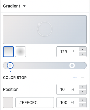 Example of how we set the colors up in the developer theme.
Top Left Image
The image that displays in the top left of the slide.
Bottom Left Image
The Image that displays in the bottom left of the slide.
Right Image
The image that displays on the right of the slide.
Simple Featured Video Section
Section Settings ( Global )
Featured Video URL
The url for the video that will be featured on the slide. You must upload your video to the shopify cdn before the link can be used in this section.
Title
The custom text for the title of the section
Subtitle
The custom text for the subtitle of the section
Description
The custom description text for the section
Button Text
The text that is applied to the button. If this is left blank and no play button is specified, the button will not show
Button URL
Button accepts 2 types of URLs
- a URL that is from the shopify CDN
- a URL that is an external video link for an iframe ( youtube , vimeo )
Play Button ( Optional )
The Play button that will take the place of the default button for the video modal. If this is left blank, a generic button with the button text will take it's place. Leaving the button text blank and adding an image in here will only show the image as the button.
Advanced Side By Side Section
Section Settings ( Global )
Featured Media - Video URL
The URL for the video that should be playing in the content panel
When a video url is found, it takes priority over the image setting.
Featured Media - Image
The custom image that should be displayed in the content panel
When a video url is not found in the editor field, an image with then take it's place.
Heading
The content panel's custom heading
Description
The content panel's custom description
Reverse Layout
Reverses the layout of the content on desktop. On mobile it affects the side of the screen that the image / video is anchored to.
- Unchecked -> Image will be anchored to the right side of the screen on mobile.
- Checked -> Image will be anchored to the left side of the screen on mobile.
Block Settings ( Highlighted Features Block )
NOTE: All settings are optional. You can use any combo of these 4. The order in which the options are displayed remains static.
Icon
A custom icon to display within the Featured block's grid
Heading
Custom heading text to display within the Featured block's grid
Subheading
Custom subheading text to display within the Featured block's grid
Disclaimer Text
Custom disclaimer text to display within the Featured block's grid
Simple Side By Side Section
Section Settings ( Global )
No Section level Settings available.
Block Settings ( Card Block )
Featured Media - Video URL
The URL for the video that should be playing in the content panel
When a video url is found, it takes priority over the image setting.
Featured Media - Image
The custom image that should be displayed in the content panel
When a video url is not found in the editor field, an image with then take it's place.
Heading
The custom section heading