Video / Static Block & Shop The Look Configuration
Video / Static Blocks
On the default collection template, you now have the option to add static images or a video
Under the collection pages section, you can add a content block
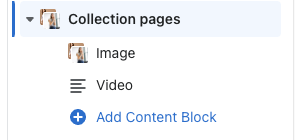
In this block, you can either choose to add an image or add a video link
Content Display Settings
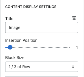
Title = Specify if it is an Image or Video
Insertion Position = On the range slider, choose where you want this content to display in the collection row
Block Size = The size of the block when added to the collection page. You can choose 1/3 of row,
2/3 of row, and full width
Content Background Settings
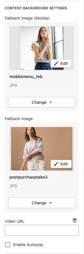
Fallback Image (Mobile) = Add the mobile sized image here. Note - when a mobile image is added here, this is the static version of content, not video.
Fallback Image (Desktop) = Add the desktop sized image here. Note - when a desktop image is added here, this is the static version of content, not video.
Video URL = Add the video link here - youtube, vimeo, mp4. Note - when you added images in the blocks above AND add a video link, the images are fallbacks if the video does not load.
Enable autoplay = Check this box if you want to autoplay the video. If not, leave unchecked and the user will have to click to play.
Content Settings
\
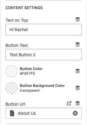
Text on Top = The text that shows on top of the image or video
Button Text = Text that shows in the button
Button Color = Changes the button text color and text
Button background color = adds a background color to the button
Button URL = The link you want the button to bring the user to\
Overlay Settings
\
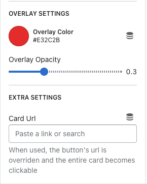
Overlay color = the color of the overlay you want on top of the image
Overlay opacity = You can choose how light/dark you want the opacity to be using the range slider
Card URL = When you enter a link in this field, the button URL is overridden. The entire block becomes clickable instead of just the button
Laydown Section (Shop the Look)
This section is called LAYDOWN SECTION. It works just like the section used on the holiday gift guide templates.

To add the tags on the product, click on ADD DOT COORDINATES
Laydown Section Settings
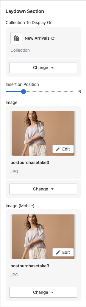
Collection Selector = Choose the collection you would like this section to appear on
Insertion Position = You can choose where you would like this section to appear in the collection row
Image (Desktop) = Image used for desktop
Image (Mobile) = Image used for mobile
Dot Coordinate Settings

X Position (Desktop) = Horizontal position of the tag on the image that sits on the product for desktop
Y Position (Desktop) = Vertical position of the tag on the image that sits on the product for desktop
X Position (Mobile) = Horizontal position of the tag on the image that sits on the product for mobile
Y Position (Mobile) = Vertical position of the tag on the image that sits on the product for mobile
Product = the product that the tag will show the user when they click it\