New Homepage Sections Configuration
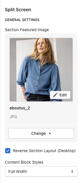
Split Screen Section
General Settings
Image - add the image that will display next to the color block
Reverse Section Layout - reverses image to show on the left or right
Content block styles - shows as full width or overlapped
\
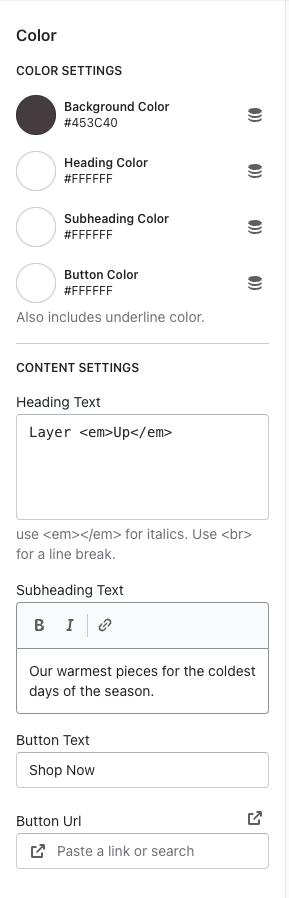
To add a color - click the ADD COLOR option
Color Settings
Background color, heading color, subheading color, & button color
Content settings
Heading text - use <em>Text</em> to italicize the text
Subheading text
Button text
Button Link
\
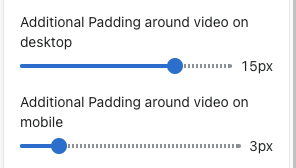
Video Section
You can now control the padding around the video on desktop AND mobile
Use the range slider to add padding around the video
Category Blocks Section
Add a block to the section
Images - you have the option to specify a desktop image and a mobile image. If no mobile image is added, it uses the desktop image.
Title
Button text
Button link
Font color selector
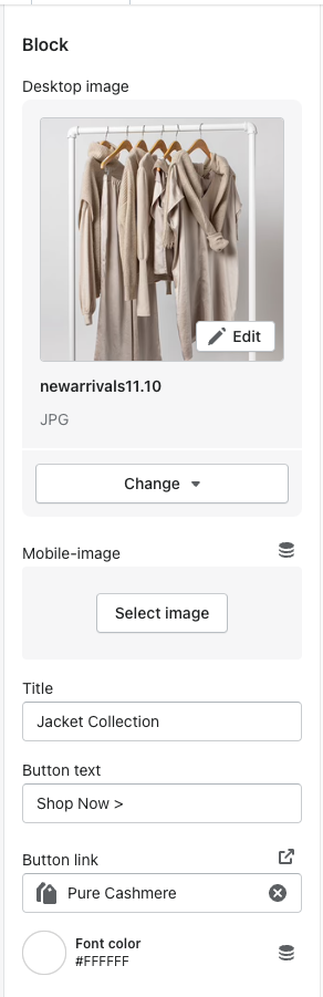
Image specs - needs a max width of 650px. Can be however tall you'd like
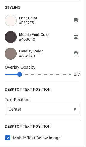
Image with Text Overlay
Title, button text, button link
Have the option to specify a desktop & mobile image
Font color, mobile font color, and overlay color
Overlay opacity - can choose how light or dark you want the overlay to be on top of the image
Desktop text position - have the option to choose where you want the text placed on the image
Have the option to move the text below the image on mobile or it can be on top of the image

Single Image Section
You now have the option to add an overlay to this section as well

Image Dimensions
Split screen section:
2000x2000
Minimum size - 1200x1200
-a825a12d09bf37c8ad6133f9566659d7.png)
-e59efeb9649dfe20e494a1aa580ad7bb.png)
Category blocks section:
1000x2200
-9718b50a0e30c4c36087e1aca88c5ab9.png)
Image with text overlay section:
2500x whatever you want for a height
Recommendation - 2500x1500
-a33eb94f49e1d9a94d5b602ca27fec9f.png)