Product Display Page - Quickstart Guide
Product Metafields
product-detail-viewer
- Definition Settings: https://admin.shopify.com/store/sord-fishing-products/settings/custom_data/product/metafields/7594311917
- The page template that contains the customized view of the product for the Product Detail Viewer Section.
Product Video
- Definition Settings: https://admin.shopify.com/store/sord-fishing-products/settings/custom_data/product/metafields/7564820717
- Determines what video should be rendered on the PDP
Custom Product Title
- Definition Settings: https://admin.shopify.com/store/sord-fishing-products/settings/custom_data/product/metafields/7564755181
- The product’s custom title that renders in the video section and Product Detail Viewer Section.
Custom Product Subtitle
- Definition Settings: https://admin.shopify.com/store/sord-fishing-products/settings/custom_data/product/metafields/7564787949
- The product’s custom subtitle that renders in the video section and Product Detail Viewer Section.
Short Description
- Definition Settings: https://admin.shopify.com/store/sord-fishing-products/settings/custom_data/product/metafields/7562985709
- The custom RTE description that will display in the Product Information section in place of the original RTE description.
Breadcrumbs Section
 Breadcrumbs Section when it is rendered
Renders the url breadcrumb trail to land on current page.
Section Settings
No settings available for this section.
info
Currently not in use ( hidden )
Product Information Section
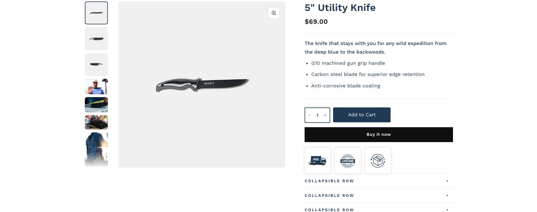 Product Information Section
Renders the product images / title, pricing, descriptions, and product forms.
Section Settings
| Title | Functionality |
|---|---|
| Make section full width | When enabled, section no longer honors section max-width of 1360px. Instead, section spans full width of viewport |
| Show tax and shipping information | Setting does not currently do anything and is not linked to any output |
| Use Rounded Corners on Images | Makes all slideshow images have rounded corners instead of sharp corners |
| Place Slide Arrows in thumbnail row | When the Thumbnail position is set to bottom, instead of the thumbnails displaying on the main image, they display in the thumbnail row. |
| Infinite Slider | When enabled, slideshow will loop between the first and last slide depending on the direction toggled. |
| Thumbnail position | Determines if the the thumbnails will display to the left of the main product image or underneath it. |
| Hide unselected variants’ media | Only shows the media for the currently selected variant and not others. |
| Enable Image zoom | When enabled, a zoom icon will now show in the top right corner of the main product image. When toggled, it opens a zoom modal with all product images loaded in a slideshow |
| Enable Video looping | When enabled, videos will now start over when the finish playing |
info
Documentation currently only covers blocks that are being actively used.
Block ( Title )
 Title Block
Shows the product title.
Block Settings
| Title | Functionality |
|---|---|
| Show product rating | Determines if review stars should display when the product has reviews |
| Make Title Bold | Increases font weight of the title to 600 |
Block ( Description )
 Description ( using metafield value )
Shows the product’s short description from the metafield. Uses the RTE description from the product admin as a fallback.
Block Settings
No settings available for this block.
Block ( Variant Picker )
Shows Product variant options selectors.
Block Settings
| Title | Functionality |
|---|---|
| Type | Determines if the variant selector should be a single selector or a set of radio buttons |
| Enable Color Swatches | When enabled, color options will now output as swatches. |
| Show Availability in selectors | When an option is selected, unavailable variants will be crossed-out. |
Block ( Product Form )
 Product Form
Displays key product actions like the quantity selector, Add to cart button, and buy now buttons.
Block Settings
| Title | Functionality |
|---|---|
| Show Quantity Selector | Determines if the quantity selector will render in the form |
| Show Dynamic Checkout Buttons | Determines If the buy now buttons will show |
| Enable Rounded Buttons | Forces all the CTA buttons to have rounded corners |
| Clamped Button Width | ATC button will have a clamped width so it cannot exceed a certain size |
| Clamped Button Width for Dynamic Checkout buttons | Buy now buttons will have a clamped width so it cannot exceed a certain size |
| Show recipient form for gift card products | Determines if a special form will show on Gift card products. |
Block ( Collapsible Row )
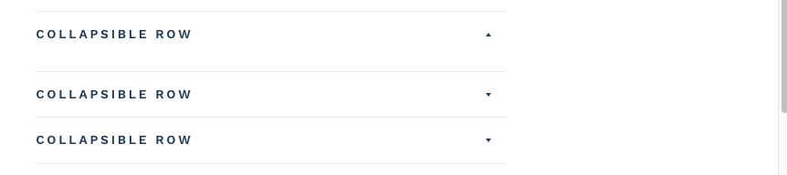 Collapsible Row
Renders an accordion that you can add custom liquid content / page content in.
Block Settings
| Title | Functionality |
|---|---|
| Heading | The title of the accordion |
| Open By Default | Determines if the accordion should start out as expanded |
| Row Content | Rich text content for the accordion if no page / custom liquid is defined |
| Row Content from page | Select a page that you’d like to display the content of |
| Custom Liquid | Add custom liquid to the block to output |
Block ( Product Icons )
 - sord-0296e66ab308ccc397c3abcee43ce1e9.png) Product Icons
Product Icons
Renders a row of static product icons.
Block Settings
| Title | Functionality |
|---|---|
| Icon Background Color | The background color for the icon block |
| Show Free Shipping Icon | Determines if icon should show |
| Free Shipping Icon | The shipping icon to render |
| Show Lifetime Warranty Icon | Determines if icon should show |
| Lifetime Warranty Icon | The shipping icon to render |
| Show Free Returns Icon | Determines if icon should show |
| Free Returns Icon | The shipping icon to render |
Block ( Share )
 Share Icons
Renders the product share buttons for included social media sites
Block Settings
No settings available for this block.
Product Tabs Section
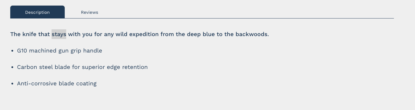 Product Tabs Section
Renders the Product description / Reviews in a tabbed view
Section Settings
No settings available for this section.
Product Video Section
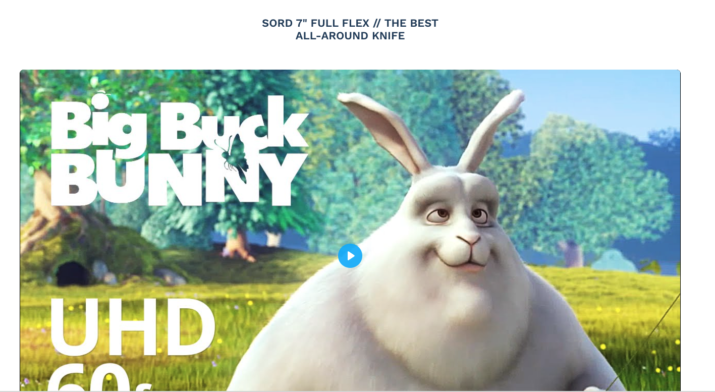 Section with video loaded
 Section in customizer when no video is loaded.
Renders a video link defined in the Product Video Metafield. When no video set, the customizer will show a block letting the admin know that no video is set. For a customer, this will not show any content since the section has no video to display
Section Settings
| Title | Functionality |
|---|---|
| Background Color | The background color of the entire section |
| Text Color | The text color of the section title |
Product Detail Viewer Section
 Product Detail Viewer that is fully customized
Takes a page template defined in the Product-detail-viewer metafield and renders that content.
Section Settings
No settings available for this section.
info
To configure this for a new product, create a new page with a name that matches the current product. Assign that page the "viewer" template in the admin. Customize the page to match your required parameters and save it. Once this is done, assign this new page to the metafiled on the product.
Product Accordions Section
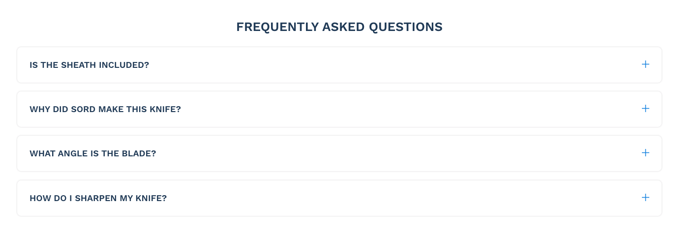 Accordions used for product FAQs
Renders full width accordions with content.
Section Settings
| Title | Functionality |
|---|---|
| Section Title | The title of the entire section |
Block ( Accordion )
The dropdown’s content
Block Settings
| Title | Functionality |
|---|---|
| Accordion Title | The title that will display in the toggle button |
| Accordion Content | The content that will display when the toggle button is expanded |
Featured Products Section
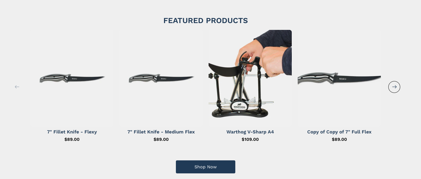 Featured Products slider with more than 4 products
Renders Featured Product in a slideshow
Section Settings
| Title | Functionality |
|---|---|
| Section Title | The title for the section |
| Section Background Color | The background color of the section |
| Enable Section Button | Shows the button under the featured product slider |
| Section Button Text | The text for the button under the slider |
| Section Button Link | The url for the button under the slider |
| Number of featured products | Determines how many featured products are pulled in from the search and discovery app. Default is 5. |
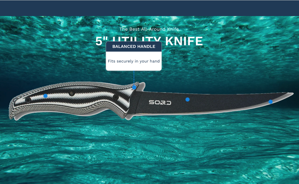
Page Detail Builder Section
The section that let's you build the product detail viewer section.
Section Settings
| Title | Functionality |
|---|---|
| Title | The title that displays on top of the image. Text Content renders under the image on mobile. |
| Subtitle | The subtitle that displays on top of the image. Text Content renders under the image on mobile. |
| Text Color | The color of the text on desktop. Mobile will always be theme default title colors |
| Background Image | The image to display the dots over. Uses one image for both desktop and mobile. |
Block ( Dot )
The dot that displays over the image.
Block Settings
| Title | Functionality |
|---|---|
| Title | The title of the popup bubble |
| Description | The body content of the popup bubble |
| Dot X Position | The X position of the dot on desktop ( relative to the background image ) |
| Dot Y Position | The Y position of the dot on desktop ( relative to the background image ) |
| Dot X Position ( Mobile Only ) | The X position of the dot on mobile ( relative to the background image ) |
| Dot Y Position ( Mobile Only ) | The Y position of the dot on mobile ( relative to the background image ) |