Navigation
In the navigation section of Shopify, this is how the header navigation / footer navigation is controlled.
Navigation section of Shopify: https://materials-stone.myshopify.com/admin/menus?channel=true
Header Navigation
There are currently two menus that are used to build the header navigation.
- Top-Level-Navigation - The top bar in the header
- Main Mega - The mega menu under the top bar
Configuration for the Top Level Navigation

To configure links in the top level navigation, open the Top-Level-Navigation editor. This allows you to do a few things:
- Create a new link
- Click "Add Menu Item"
- Enter a name in the name filed
- Select a link in the link field ( Must always contain a link. Use # if no link )
- Edit a link
- Click "Edit"
- Select a link in the link field ( Must always contain a link. Use # if no link )
- Click "Apply Changes"
- Edit a link's display text
- Click "Edit"
- Enter new name in name field
- Click "Apply Changes"
- Remove a link
- Click "Delete" ( DO NOT CLICK DELETE MENU )
- Click "Remove" to remove the link
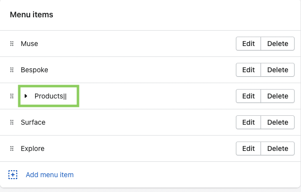
Configuration for the Mega Menu
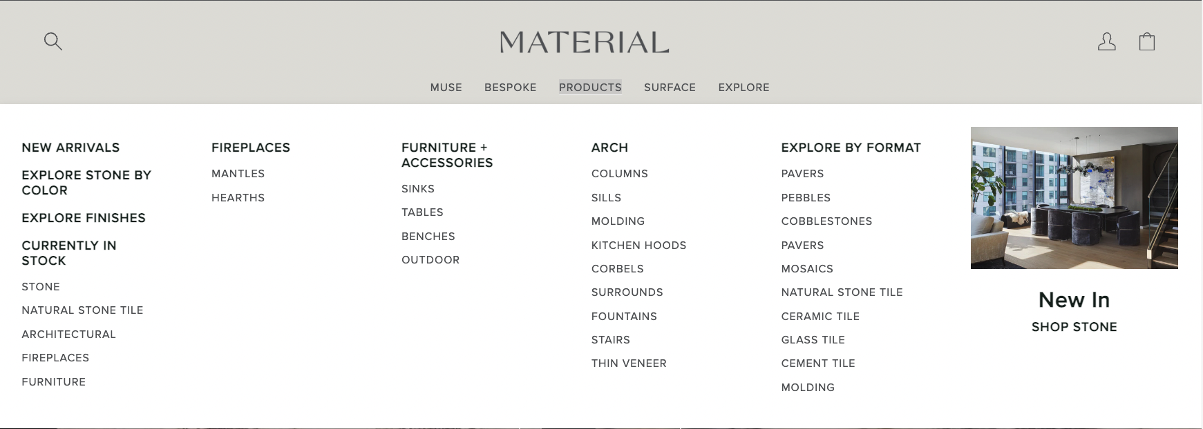
To configure links in the mega menu, open the Main Mega editor. Before editing the menu, there are few things to note:
- Top level navigation should never contain a '|||'. This is used for something else
- To denote that the navigation level has dropdown content, append '||' to the end of the name. See example below:
- To denote that the navigation should be moved to a new line, add a '|||' to the final sub-link of a child link. See example below:
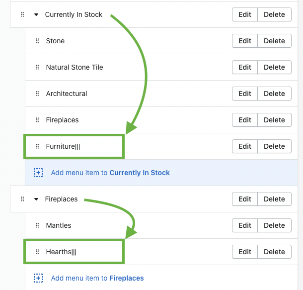
These configurations will result in the following:
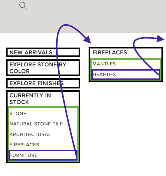
The Black Boxes -> Child Links
The Green Boxes -> Grand Child Links
The Purple Boxes -> The Last GrandChild Link
[NEW] Mega menu Hover Images
Header Section ( New Settings )
- Enable Exit Hover Image Update - When new hover system is enabled, this will revert the image back to default when we exit hover. Only turn this on if you want the image to change back to the original when you are done hovering over a link.
- Fallback Hover Image - This is a default image you can set when you add a mega menu block that has no image but you add a hover block. When a hover block is added, the base mega menu block must have an image. This setting can be left blank if other blocks are configured properly.
Mega Menu Hover Image ( New Block )
- Title - This text must match a link title that you want the hover effect to apply to. Example: in the MUSE menu, there is a link called Donna Mondi. Putting "Donna Mondi" in the field will make that link trigger the hover image system.
- Hover Image - The image that will be shown when the associated link is hovered over. This will replace the current MM image with this image.
Mega Menu Block ( Existing Block )
- Standardize all image sizes in menu - When enabled, all mm images will crop and use the aspect ratio of 109:45. Only applies to the current menu.
When a Mega Menu Hover Image is linked to a Mega Menu, the second MM image setting no longer has any effect and will not show
Footer Navigation
The footer navigation is broke up between desktop and mobile. The mobile menu is strictly for MOBILE.
Desktop:
Footer Left Menu - https://materials-stone.myshopify.com/admin/menus/185387483170
Footer Middle Menu - https://materials-stone.myshopify.com/admin/menus/185387647010
Footer Right Menu - https://materials-stone.myshopify.com/admin/menus/185387679778
Mobile:
Footer Mobile Left Menu - https://materials-stone.myshopify.com/admin/menus/186368131106
Footer Mobile Right Menu - https://materials-stone.myshopify.com/admin/menus/186368524322