🏛️ Mouldings Landing Page: Customization Guide
Getting Started
First, we need to create a page to hold all of our new template's sections. Start by creating a new page in Shopify.
Once the page is created, assign it the template called: "mouldings-alt". This will setup the page to pull content from the correct template.
After this is done, go to the theme editor for your theme and search for the page template called "mouldings-alt."
Once the template has loaded, you can now start adding sections to the page.
Creating content for the split vertical Section
In order to render content in the split vertical section, you will need to assign page templates to each block you add to a column.
For the sake of simplicity, a few pages have already been created to use with this section along with unique templates assigned to each of them.
| Page Title | Template Assigned | Link |
|---|---|---|
| The Craftsman Surfaces | craftsman-surfaces | visit |
| Image Six Pack | image-six-pack | visit |
| Vertical Image List | vertical-image-list | visit |
Each template's sections can be modified in the theme editor and customized exactly as desired. More details about the new sections can be found below.
Section currently supported in page tempaltes:
- the Image Six Pack
- Rich Text
- Vertical Image List
- Shop By Surface Section
Adding more support will require the help of a developer. You need to add a specific attribute (data-injection-content) to the section for it to be supported.
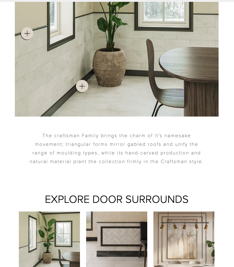
The Split Vertical Section
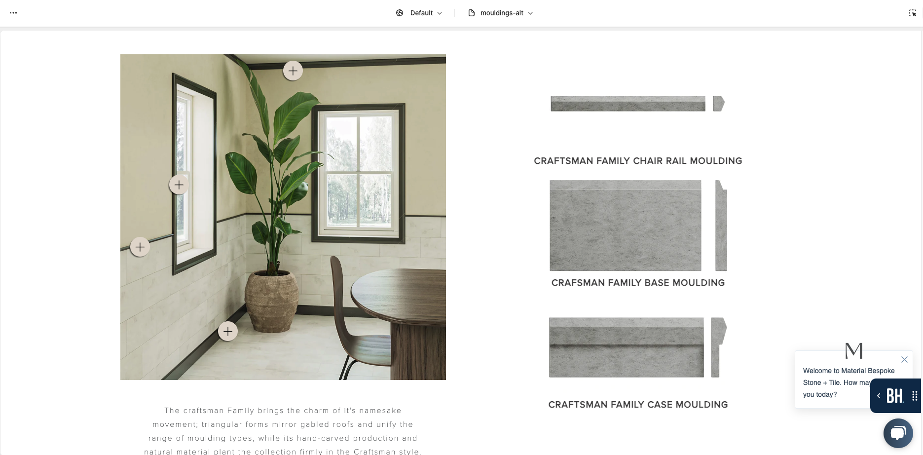
Renders a section that is split down the middle with custom content blocks that can be assigned to either side of the view.
Section Settings
No settings available for this section.
Block ( Left Column Content )
Block assigns content to the left column in the order that it is added.
| Title | Functionality |
|---|---|
| Page Template Reference | Allows you to assign a page that is used to pull configured content from. Section currently supports the Image Six Pack, Rich Text, Vertical Image List, and Shop By Surface Sections |
| Draw Debug Squares | Use to see where the section will show in the customizer |
Block ( Right Column Content )
Block assigns content to the right column in the order that it is added.
| Title | Functionality |
|---|---|
| Page Template Reference | Allows you to assign a page that is used to pull configured content from. Section currently supports the Image Six Pack, Rich Text, Vertical Image List, and Shop By Surface Sections |
| Draw Debug Squares | Use to see where the section will show in the customizer |
The "Draw Debug Squares" setting should only be used to visualize the placement of the page content you will be pulling in.
Image Six Pack Section
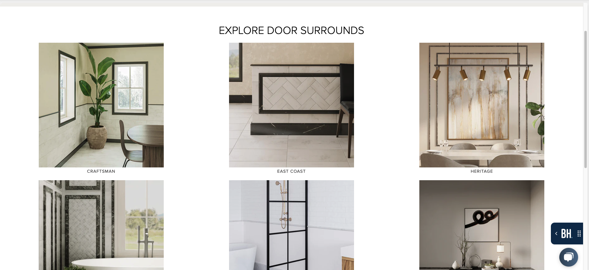
Displays a grid of up to 6 images where each row can either have 2 or 3 images in it depending on the screen size.
Section Settings
| Title | Functionality |
|---|---|
| Heading | The title that displays above the image grid |
Block ( Image )
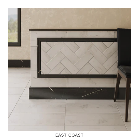
Renders one image with a title and a link attached to the title. Can add up to 6 unique blocks.
| Title | Functionality |
|---|---|
| Image | The current six pack image to display |
| Title | The title that displays underneath the image |
| Block Link | The link attached to the title of the block. Can be blank |
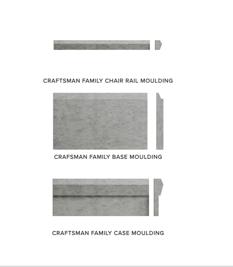
Vertical Image List
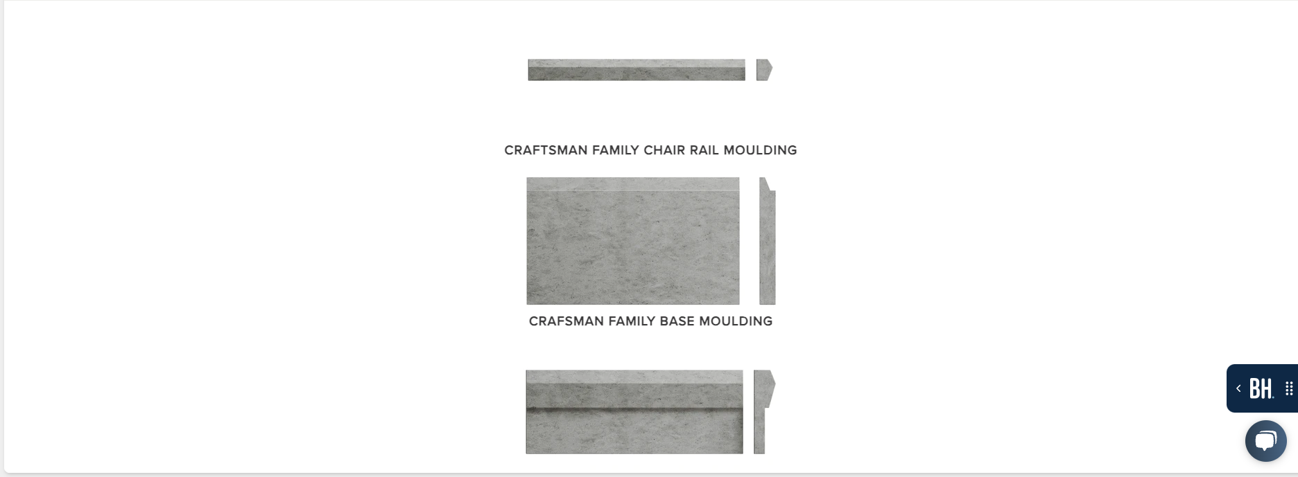
Displays a vertical list of images. Designed to be used with the split vertical section
Section Settings
This section has no section settings
Block ( Image )
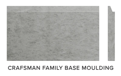
Renders one image with a title and a link attached to the title. Blocks stack vertically.
| Title | Functionality |
|---|---|
| Image | The current image to display |
| Title | The title that displays underneath the image |
| Block Link | The link attached to the title of the block. Can be blank |
Shop By Surface Section
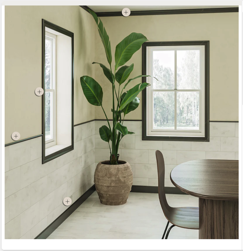
renders an image with selected points on top of the image. Each point is a block within the section. Can configure uniquely for desktop and mobile.
Section Settings
| Title | Functionality |
|---|---|
| Section Image ( Desktop ) | The Image that displays on desktop screens |
| Section Image ( Mobile ) | The Image that displays on mobile screens |
Block ( Product )
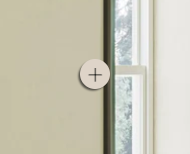
Renders a selectable button over the section image.
| Title | Functionality |
|---|---|
| Button Distance From Left ( Desktop ) | The x distance from the top left corner of the image ( in percentage ) |
| Button Distance From Top ( Desktop ) | The y distance from the top left corner of the image ( in percentage ) |
| Button Distance From Left ( Mobile ) | The x distance from the top left corner of the image ( in percentage ) |
| Button Distance From Top ( Mobile ) | The y distance from the top left corner of the image ( in percentage ) |
| Product Link | The link attached to the button. |