⚙️ PDP Required Sections
***DEV NOTE*** UNKNOWN SOURCE means that the data needed to update that field does not have a metafield source on the product yet. In other words, it's the default value we gave to any data that has no source.
PDP Media Column
This section renders all of the product media on the left half of the page. When you click on a product image, this opens a modal with the product image in a slideshow. On mobile, we should expect that when a product has more than 1 image, the images compress into a slideshow with slide dots / arrows.

Product Media on Desktop
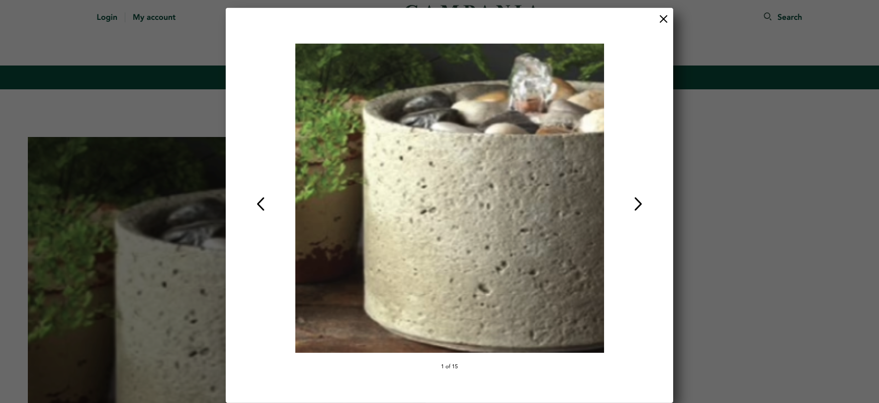
Product Media Modal
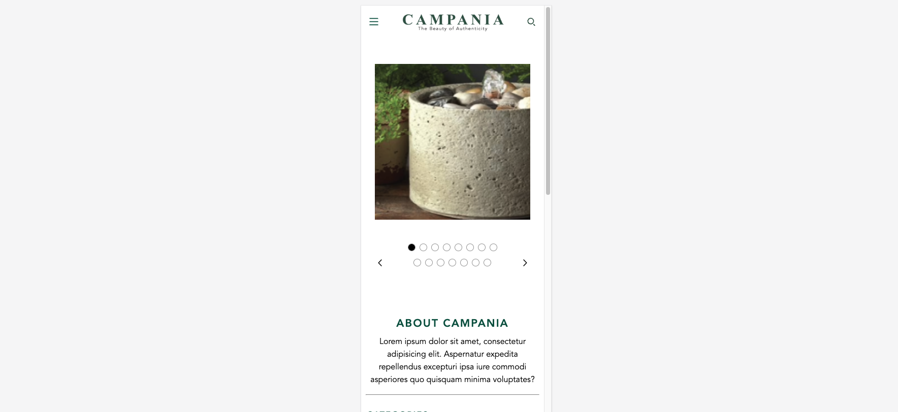
Product Media on Mobile
Section Settings
No settings available for this section.
PDP Details - Default / PDP Details - Fountains
***NOTE*** The PDP templates have exactly the same blocks available + the same settings. The only differences are that the default template uses the Quick Access Info Chart Block and Swatches for product options instead of dropdowns.
Section Settings
No settings available for this section.
Available Blocks
General Info
Renders general product information such as the, title, price, SKU, and inventory levels
| Setting Name | Setting Type | Setting Description | Default Value |
|---|---|---|---|
| Show "shown-in:: " tags | checkbox | Determines if the "Shown in" text will display under the product title | FALSE |
| Show Product SKUs | checkbox | Determines if the Product SKU box should be displayed | FALSE |
| Show Inventory Levels | checkbox | Determines if the Show Inventory Levels should be displayed | FALSE |
| Low Inventory Threshold | number | Determines the transition point for "In Stock" vs "Limited Inventory" Text | FALSE |
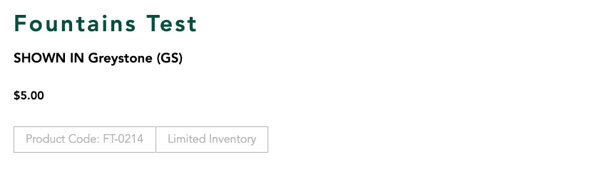
General Info with all settings enabled
Divider
Renders a fullwidth divider. Divider is always Campania Green
No settings available for this block.
Product Options
Renders the product options for the current product. Product options can be in a dropdown or listed as swatches. Clicking outside of the dropdown list will close all dropdowns on the page.
| Settings Name | Settings Type | Settings Description | Default Value |
|---|---|---|---|
| Debug Hidden Dropdown | Checkbox | Allows the hidden dropdown to be visible for developers when they are debugging. | FALSE |
| Product Option Types | Select | Choose between options being displayed in dropdowns or as swatches | Dropdowns |
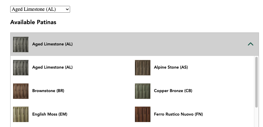
Dropdown View ( DEBUGGER ENABLED )
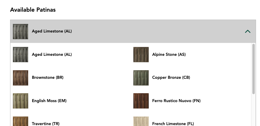
Swatches View
Quantity Selectors
Renders the add and subtract buttons on the PDP. QTY can never go below 1 or above the total stock amount for a given variant. Upsells can be configured on the product's metafields.
| Settings Name | Settings Type | Settings Description | Default Value |
|---|---|---|---|
| Enable Upsell | Checkbox | Enables the ability for all the different upsell metafields to be displayed. | TRUE |
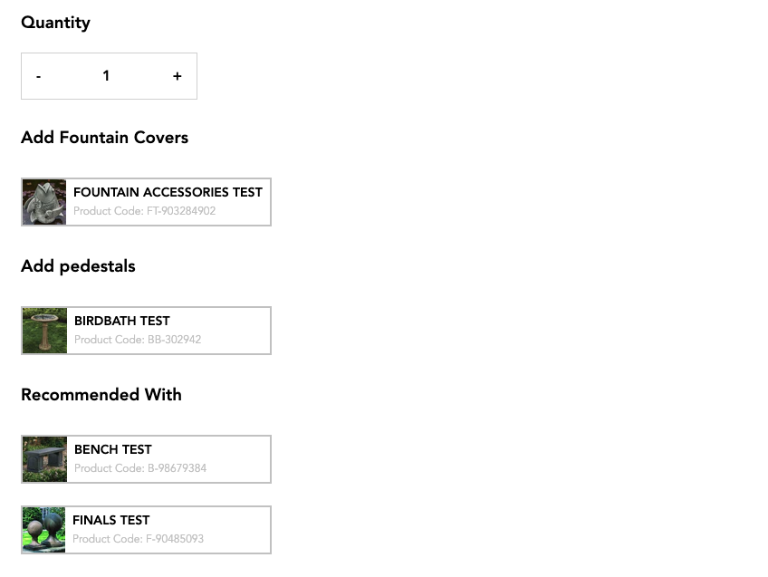
Selectors with Upsells

Selectors without Upsells

Selectors when variant is out of stock
Add To Cart Button
Renders the add to cart button and the add to cart validation message.
No settings available for this block.
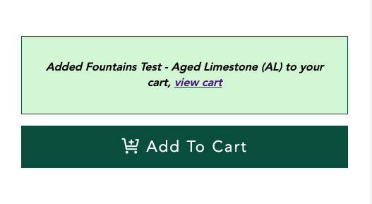
Add to cart: Successful
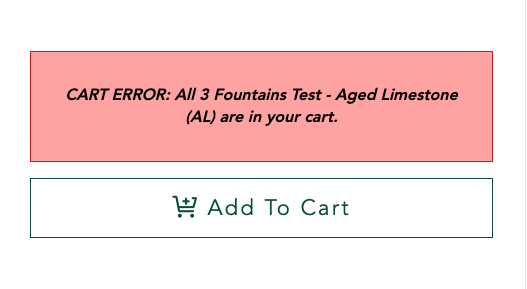
Add to cart: Failed

Add to cart: Variant Out of Stock
Wishlist Button
Renders the wishlist button. Button styles and logic is handled through the smart wishlist app.
No settings available for this block.

Add to Favorites Button

Remove From Favorites Button
Product Specifications
Renders the Product Specifications Dropdown. The data updates in dropdown when variant is changed. References Metafields on the product variant to update data.
| Settings Name | Settings Type | Settings Description | Default Value |
|---|---|---|---|
| Expand By Default | Checkbox | Expands the accordion on page load. | FALSE |
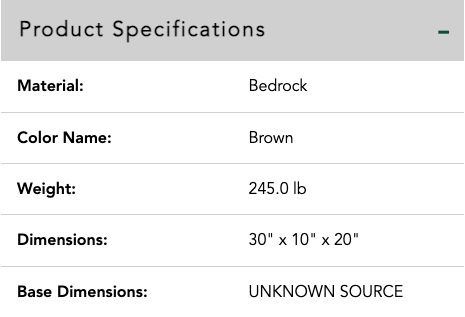
Product Specifications Expanded

Product Specifications Contracted
Product Details
Renders the Product Details Dropdown. The data updates in dropdown when variant is changed. References Metafields on the product + product variant to update data.
| Settings Name | Settings Type | Settings Description | Default Value |
|---|---|---|---|
| Expand By Default | Checkbox | Expands the accordion on page load. | FALSE |
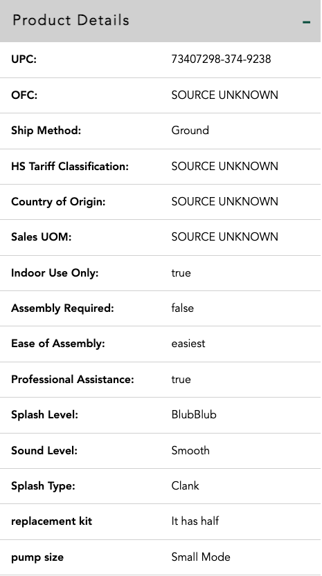
Product Details Expanded

Product Details Contracted
Downloadable Content
Renders the product's downloadable Content metafields.
| Settings Name | Settings Type | Settings Description | Default Value |
|---|---|---|---|
| Expand By Default | Checkbox | Expands the accordion on page load. | FALSE |

Downloadable Content Contracted
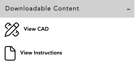
Downloadable Content Expanded
Product Care
Renders a contact support button in an accordion.
| Settings Name | Settings Type | Settings Description | Default Value |
|---|---|---|---|
| Expand By Default | Checkbox | Expands the accordion on page load. | FALSE |

Product Care Contracted
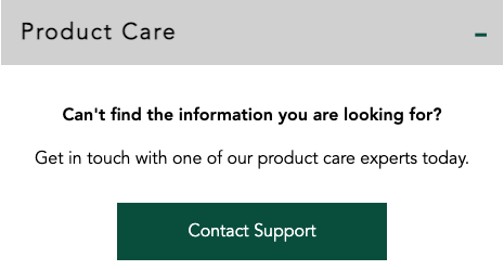
Product Care Expanded
FAQ
Renders the FAQs metafield data as an accordion.
| Settings Name | Settings Type | Settings Description | Default Value |
|---|---|---|---|
| Expand By Default | Checkbox | Expands the accordion on page load. | FALSE |

FAQs Contracted
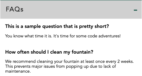
FAQs Expanded
Share Buttons
Renders Facebook and Pinterest share links on the PDP.
No settings available for this block.

Share Buttons on bottom of PDP
Quick Access info Chart
Renders the Material, Base Dimensions, Dimensions, and weight data for the product. Data changes when the variant is swapped.
No settings available for this block.